If you’re a conscientious developer like I am my boss is, you probably have
a benchmark suite for the programs and libraries you develop. This allows you
to see the impact of your changes on the performance of your applications.
However, the temporal aspect of these benchmark suites is not always easy to
analyze.
That was the case recently in one of our projects with Novadiscovery. We had many carefully crafted benchmarks for all the performance-sensitive parts of our code, which we ran daily on our CI and were exported as a nice html page such as this one. But to be honest, hardly anyone looked at them, for the simple reason that looking at a given benchmark result was most of the time absolutely meaningless. The only sensible thing to do was to compare the results through time.
The best way we had to compare two runs of a benchmark suite was to take the html report that criterion generated for each run, put them side-by-side and find the differences. These reports consist of a big list with for each individual benchmark a bunch of numbers and graphs for each individual benchmark (like this). With around fifty benchmarks in the suite, comparing these by hand starts being… complicated.

In addition, these report files don’t carry any information about when they have been generated or on which commit. Which in particular means that it’s really easy to mix the windows up and invert them. Which when you realize it can be really frustrating (although some of my colleagues found it rather funny when they learned that it actually happened to me… don’t know why).
The consequence of this was that unless we had a really compelling reason to do so (like the users calling out for help because their program was suddenly running twice slower than before), we just didn’t look at them. And obviously this meant that we had accidentally introduced several annoying performance regressions without even noticing them.
So we decided to give ourselves a way to quickly view the evolution of the performance of our library through time, which meant:
- Keeping a record of our benchmark results.
- Providing a way to display and analyze them.
Setting-up a history of our benchmarks
It happens that we already wrote here on that topic, but the procedure presented had two drawbacks:
- It required the use of a particular and experimental benchmark framework
(
hyperion), while we were using the much more mainstreamcriterion. - The results were stored and analyzed using
elasticsearchandkibana, which, while extremely powerful and flexible represent external services which both require some amount of work to be deployed and maintained. Each benchmark run produces slightly less than 20K of data, so even with a few hundred of benchmarks we’re still in a range that even the smallest AWS instances can manage. Given the low volume of data we were going to manipulate, there was no need for such beasts.
So while retaining the same basic idea, we decided to adapt this approach for something simpler to set up, i.e.
- An r-shiny-based visualization tool taking as input a stream of json records containing all our benchmarks results.
- A simple script using jq to format the output of
criterionto the format expected by the R script.
Note that these two parts are largely independent: The JSON emitted by the jq
script is very close to the one emitted by hyperion and could easily be fed
to any tool (such as the elasticsearch cluster proposed in the hyperion
post). Conversely, the webapp accepts a really simple
format which doesn’t have to be generated by criterion.
Note also that this setup won’t give all the benefits that hyperion brings
over criterion, in particular we don’t get the possibility to show the
duration of an operation as a function of its input size.
The two tools are available as benchgraph.
Simplifying Criterion’s output
Criterion is able to export the results of the benchmarks in a JSON file,
which allows us to analyze them further.
However, we need to trim the output to make it easy to import on the web
application: criterion dumps its big internal state on it, including all
the runs it does for each benchmark (because each bench is run a few hundred
times to limit the inevitable noise) and a lot of analyses that we don’t need.
It also does not include some useful information for us, such as the
revision id
and the date of the commit this benchmark ran on, which we need to
identify it later.
Thanks to the wonders of jq, it is only a matter of a few lines of code to
transform
this into:
{
  "time_in_nanos":0.005481833334197205,
  "bench_name":"1000 RandomTrees/Evaluation/Safe Val",
  "commit_rev":"dd4e6c36b913006d768d539bfc736bf574043e20",
  "timestamp":1535981516
}
{
  "time_in_nanos":0.004525946121560489,
  "bench_name":"1000 RandomTrees/Evaluation/Safe Val Int Tree",
  "commit_rev":"dd4e6c36b913006d768d539bfc736bf574043e20",
  "timestamp":1535981516
}
Visualization interface
Disclaimer: I’m definitely not an R expert, so if anything here makes the R programmer in you cry, don’t worry, that’s totally normal and expected.
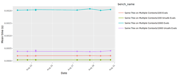
We now want to build a nice graph UI for our benchmarks. Let’s first try to make our goals a bit clearer. We want:
- A chart displaying the metrics for the benchmarks through time
- A way to select which benchmarks to display
Thanks to the rich R ecosystem, this is easy to achieve. In addition to
r-shiny for the server part, we leverage ggplot and
plotly for the graph, as well as the pickerInput from
shinyWidgets for the benchmark selection. It lets us
quickly build a nice interactive graph to compare all our commits.
Deploying the service
For this to be useful, there are two things we need to do:
- Running the benchmarks on a regular basis.
- Uploading the results to a well-known place.
The CI is the natural place for that. Note however that if you’re using a hosted CI you’re condemned to an inevitable noise since you’ll have to run your benchmarks on shared machines with unpredictable performance. This can be partially mitigated by using a proper VM instead of a docker container, or using your CPU’s instruction count.
Let’s see how this would look like on Circle CI:
We can configure our benchmark job as follows:
version: 2

jobs:
  build:
    # Use a VM instead of a docker container for more predictable performance
    machine: true
    steps:
      - checkout
      - run:
        name: Build
        command: |
          # Or `stack build :my-benchmark` or anything else
          bazel build //my:benchmark
      - run:
        name: Benchmark
        command: |
          # Run the benchmark suite
          bazel run //my:benchmark -- --json=raw_benchs.json

          # Install benchgraph and its dependency jq
          git clone https://github.com/novadiscovery/benchgraph
          apk install jq

          # Reformat the criterion output
          bash benchgraph/adapters/criterion/export_benchs.sh raw_benchs.json \
            > benchs.json

          # Send the output to s3.
          # This requires that your AWS credentials are set in CircleCI's config
          aws s3 cp benchs.json s3://my-benchmarks-output-bucket/${CIRCLE_SHA1}.json
With that, we can now generate the graph (locally for the sake of the demonstration):
mkdir benchmarks
aws s3 cp --recursive s3://my-benchmarks-output-bucket/ benchmarks/
docker pull benchgraph/benchgraph
docker run \
  -p 8123:8123
  -v $PWD/benchmarks:/benchmarks benchgraph/benchmarks \
  /bin/benchgraph /benchmarks
The resulting graph is now available at http://localhost:8123.
Going further: multi-language benchmarks
It appears (or at least, so I heard) that the entire world isn’t writing Haskell
and that there are other languages out there, and so, different benchmark
frameworks. Does that mean reinventing all that for each language and each
framework? Of course not, although this has been developed in the context of
criterion, the only Haskell-specific bit is the three-line long jq script
which converts criterion’s output to a simple stream of json records.
So any benchmarking framework which provides a machine-readable output (which hopefully means any benchmarking framework) can be easily adapted to use benchgraph, which also means that if you have a multi-language project, you can have all your benchmarks integrated in a single interface for free.
Needless to say: PRs are welcome on the GitHub repo.
Behind the scenes
Théophane is a Software Engineer and self-proclaimed Nix guru. He lives in a small house surrounded by awesome castles in the Loire Valley. When he’s not taking care of his four sons or playing some music, you might find him working.
If you enjoyed this article, you might be interested in joining the Tweag team.
